Howdy! In planning for our event, The Devil Wears Science, in the Atlanta Science Festival, I took some initiative in a few spaces. I have helped to look into the best areas, in and around campus to host our event (and what fits a small budget), with the ultimate answer landing to an on-campus event at our Living Science Building of Kendeda! I’ve also looked into potential partners, and felt impressed with Dr. Jayaraman, a professor here at Georgia Tech in our Material Science/Engineering department and brought him on board. He has been incredible, and invited an impressive colleague, Dr. Sungmee Park to join the effort. Yet, one creative aspect I’ve worked on for this event was very creatively fun and encouraged me to do some thinking on marketing/interactions between our audience! For this, I have been working on some interesting designs and flyers! Starting in fall, I made a general logo that I thought would be fun to put on basically everything. It could be used for flyers, social media, buttons, and more — maybe even given out on some items to commemorate the event! Here, I wanted to discuss the evolution of my design work! Though it’s a small turn from the usual science content, I hope you enjoy.

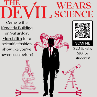
The picture above shows the general design I made during fall of 2022 – a centerpiece for future event illustrations. First, I wanted to focus on the general color palette that matches the theme. Wanting to stick to the hellish theme, I initially knew black and reds would be crucial, but it took some time to figure it all out. In trying to find how best to represent the devil here, I came to the conclusion that a men’s silhouette would be best, and finding a suave man in a suit was very fitting. Because of this, even though black is dark and brooding, it would not work for the background as it would remove some of the suit details. Instead, I chose a grey to be the background color as its one of my favorite colors and goes well with black and dark reds. Initially, I was actually working with some red dresses and devillish faces, but I enjoyed the pivot of the formal ‘Man In The Suit’ better. Moreover, I found a cool satanic-looking goat head pattern and wanted to include this in the design. Overlaying this on the head leaned into ‘The Devil Within’ vibe that sparked a lot of intrigue. With that solidified, I went on to include more science aspects into the design. I think my favorite inclusions are the subtle aspects such as having the devilish man have a chemical structure handkerchief and holding a small magnifying glass. I feel like it shows that he is interested in science, and is also slightly ‘wearing’ it as well! At the event, I enjoyed that one of the STEMComm faculty members and professor here in the Chemistry Department at Georgia Tech, Dr. Evans, came to the show with some chemical structures clipped onto his blazer! It’s a fun little parallel to this, and even though I don’t think he intended to be similar to the devil man here, it was hard not to think of it!
Onto the background details, I wanted to balance the image with more elements of science on the sides. When I found these detailed images of a microscope and telescope, I knew I wanted to include them somehow. They matched well with the sudden increase in artistic complexity of the goat skull, and added some focus on the STEM interests of the club. In order to tie it in to the design, I used these tridents for the instruments to ‘rest’ on, rather than as a devil tail or something similar. From a physics perspective, I liked the symmetry and the tridents hold a resemblance to the psi symbol (ψ) as it usually represents wave functions used in modern physics and quantum mechanics. The symmetry also reminds me of bra-ket notation also used in these fields, especially when wave functions are involved. Though most people likely won’t think of that, it was something that made me happy. With many scientific representations on and around the Devil, I felt like I was really satisfied with the general design, and it was extremely fulfilling to see it being shared on social media and on the program that was handed out to everyone at the show.
With the general design finalized, it was time to apply this to marketing the event. Since I created the design, I took initiative to also create the flyers for the event, which took many iterations to perfect.
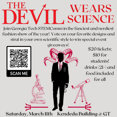
After reviewing many other flyers I wanted to keep it simple and ensure it included the basic details: event name, short description, location, date, price of tickets + how to buy them, and of course, the design. For the event name, I wanted it to look extremely similar to the flyers for “The Devil Wears Prada” since we’re doing a word play on that, so I found a similar font called RoxboroughCF on Canva. I also created a QR code so that people could easily access the ticketing website, and emphasized the date and location so that people could easily schedule to come to the event! I wanted to have a relatively balanced look, offsetting the teaser + info and ticketing information on either side.
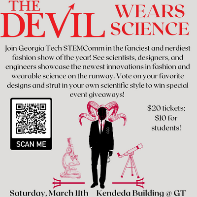
Here, I felt like the information didn’t say everything we wanted to say, so the main change I made was taking the information from the ticketing website and copying it onto the flyer. I also offset the ticketing information to balance around the character. Due to the large amount of text, I minimized the size of the devil design, which made some details a little difficult to see. I also really liked having the location and time bolded on the bottom, mirror the symmetry of the tridents on the bottom. I felt like it is still in focus enough that it can’t be forgotten, but not so awkwardly on the flyer. Plus, it allowed for more information about the event.
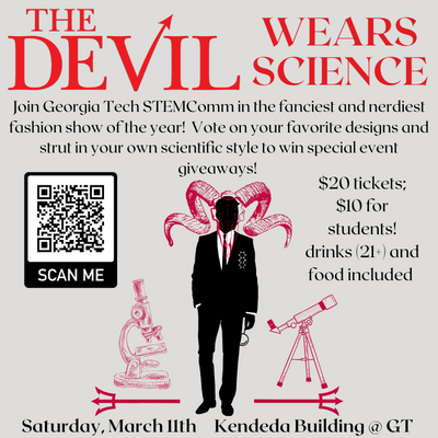
From here, I wanted to cut down on the large wall of text and emphasize the design, but it didn’t feel quite right yet. At the least, there’s more room to show the design!
I realized that the ‘text logo’ (vs. the design which I will now refer to as the logo) was too attached to the top and needed margins to look better. I think this is one of the best improvements I had made. Additionally, to help justify the price to others upon first seeing the flyer, I mentioned that we will be serving alcohol and food. The next iteration is the same except I took out ‘for all’ because it seemed redundant and not entirely true due to the legal aspects of alcohol, even if I did declare that it is for those aged 21 and over.
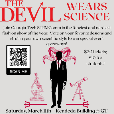
The update is shown above, with considerations in mind! Yet, it still felt word-y, and some of my peers and designer friends agreed. Thus, the final result comes along:
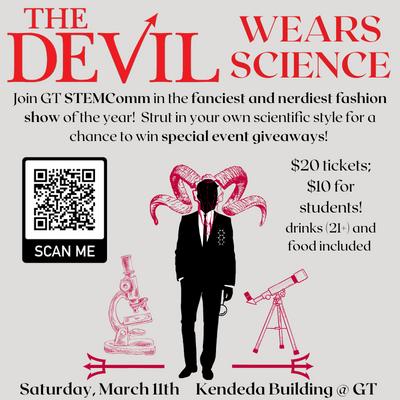
So, I really cut down and emphasized the most important aspects of the event information. Additionally, we wanted to convert the ‘voting’ to focus less on the presentations and instead on audience engagement and hopefully see a lot of fun science themed outfits (which we did)! This way, there was no inequality between presenters that we were extremely grateful to for their help with the event.
With more balance between design and text, this became the final edit with important information bolded for easier reading. Throughout the process, I looked for input from other members of STEMComm as well as from a few friends/co-workers that work on making social media graphics, and we all found consensus on this edit.
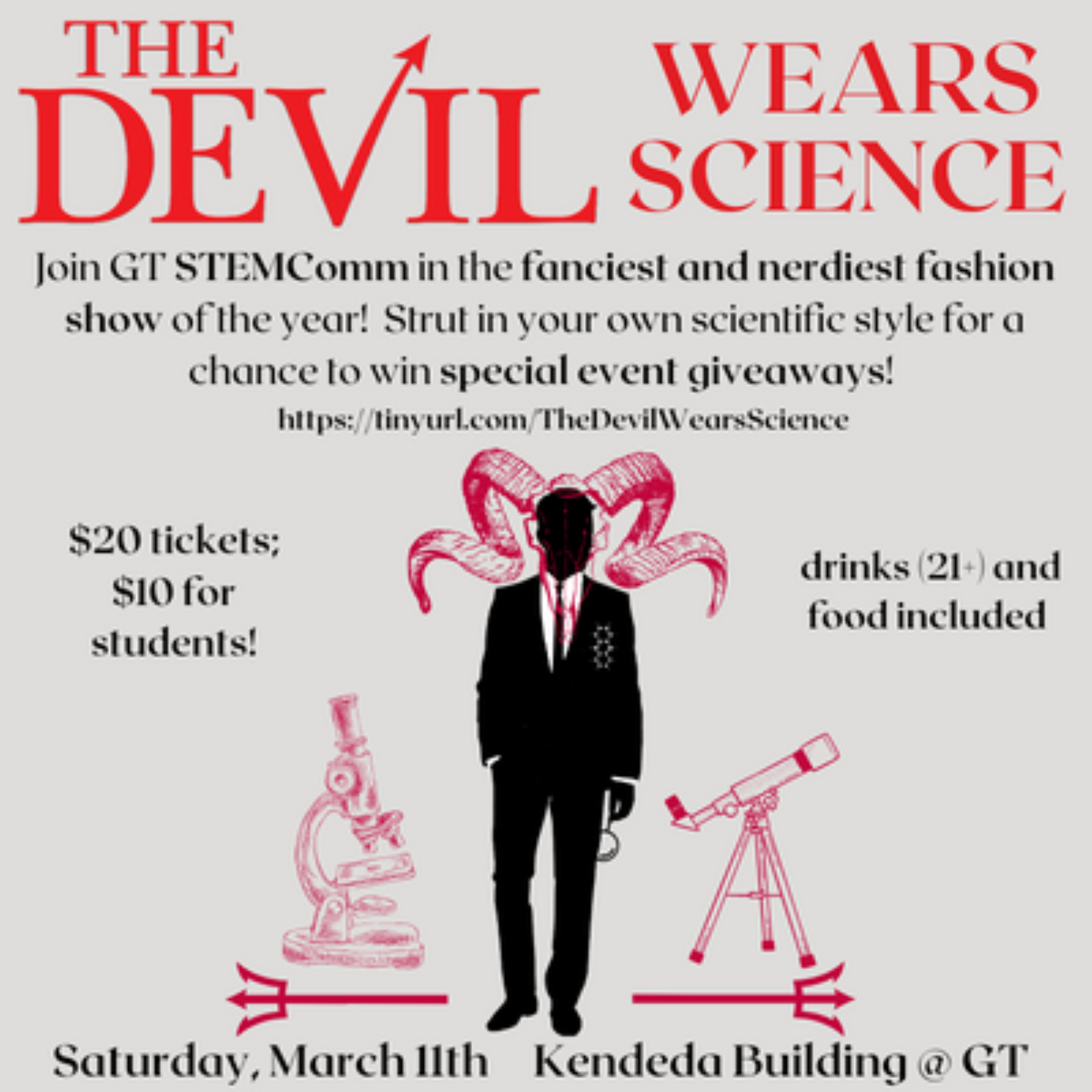
Then, for marketing purposes, we realized the importance of having a version of this flyer for social media. We knew that it would be redundant to have the QR code (those holding their phone aren’t going to need to scan with the phone their holding), but we can include links instead! For now, I have two versions that are almost identical, where one includes a tinyurl link just in case social media links get a little busy. We planned to include a linktree in the bios to access where the QR code went to, but I know sometimes on instagram, you have to go through different unnecessary steps that make people less likely to go to the link. Given that this is for social media, I also looked into the ideal aspect ratio/pixel widths so that it looks best on instagram stories or other postings.
Here is first social media flyer iteration:

Then, its evolution:
So, which one is your favorite? Do you think the final versions are the best, or is something not quite right to you? Hopefully, you’ll have already seen the final versions before and it encouraged you to come to the event.
With these finalized, the members of STEMComm all went to social media to share these online and post about the event. We also looked into sharing flyers around campus to encourage more people to come.
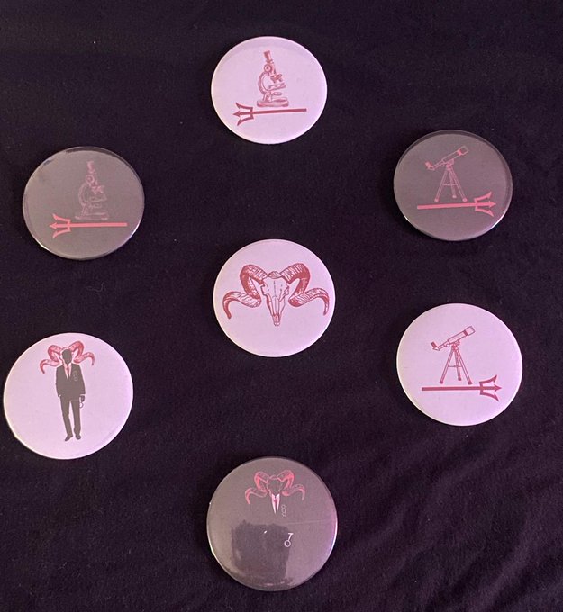
Afterward, I thought it would be nice to have small giveaways for everyone that attended. Thanks to the Invention Studio on campus (follow them @gtinventionstudio on instagram!), I knew I could make pins/buttons and more. I didn’t want the full design to be a sticker/button because its large, so I thought to emphasize the details. So, I made separate images including just the smaller elements and had two versions with white and black backgrounds for more options. I ended up with 7 main designs that I created into pins, and I think they turned out amazing and I am so glad we were able to give them all away to the attendees! Thanks to Jalen, we were able to make some stickers as well. Additionally, Dr. Leavey gave us acrylic to work with, so Isabelle and I went to the Invention Studio together and she worked with the laser cutter for some cool devil charms. One of the other STEMComm members, Michelle Stanek, was also able to make earrings from the charms as well, which turned out amazing!
And this was the evolution of the design created for The Devil Wears Science event. I was extremely grateful to use some creative abilities to help the show, along with my conversations with the MSE department leading to the presentations from Dr. Jayaraman and Dr. Park’s contribution. I cannot wait to see what STEMComm ends up doing next year. Thank you to everyone that showed up for this event!
Stay curious, everyone!